Showing posts with label Art. Show all posts

Sunday, May 5, 2013

Talley Ross-Ho!: or What We Saw in Chelsea This Week

We dropped in on our friend and dealer Daniel Cooney to drop off some work and check his new space at 508 W 26th St. The space is great and a new show of Dan Estabrook's work opens on May 9th. So instead we took in the following shows:


Amanda Ross-Ho, GONE TOMORROW @ Mitchell-Innes & Nash: Ms Ross-Ho continues her exploration of the iconography of girlhood. The show derives its title from the enormous gold earring hanging at the back of the gallery, but the show is dominated by a series of Black Rag pieces, enormous black t-shirts that have been slashed, cut and gathered and each subtitled (I Hate ____ ) where the blank is a day of the week. Four Untitled Still Lifes complete the exhibit and their collaged surfaces help bring the large t-shirts  into art history with photographs that seem to document performances of Yoko Ono's Cut Piece and bring some sobriety to a rather goofy grin of a show. I look forward to seeing more of the artist's work. Open until May 18th.

Tim Hawkinson and Richard Misrach @ Pace Galleries: Be advised! These are two very separate shows but once you're in for one you might as well take in the second. Mr. Hawkinson continues to explore the crossroads of nature and creation  Worth seeing for the enormous foot with roller toes and heel, but dive all the way into the back for Tagalong, a charming poly-resin sculpture of a sea horse with air bubbles. Mr. Misrach has headed back to the beach for more of his large-format aerial view photographs of lone figures on the beach or in the ocean. Even though the isolated figures create the desired sense of alienation, it's the images of just water I found most fascinating. New digital technology has allowed the artist to capture fleeting moments of light and color that become engrossing abstract prints at this scale. Walk up to one and don't see if you fall in! I dare you!! Both shows up until June 29th.

Sara VanDerBeek @ Metro Pictures: I'm very glad I stopped in to see this debut solo show at Metro Pictures. Ms. VanDerBeek's photographs are large, bold and shiny; minimalist studies of the photograph as an object. She then takes that objects and has us question it more through both subject matter and format. The back gallery is turned into a luscious monument, to what exactly is hard to say. The light gray stacks the artist uses throughout the installation harked back to Greek temples, but the large photographs of an oxidized wall that are then mounted under Mirona glass creates an artist's temple to self-reflection. Some delicate smaller works close out the show with subtle elegance. I want to see more! Open until June 8th.


Jannis Kounellis @ Cheim & Reade: Worth a peek. Kounellis is associated with the Arte Povera movement and these works reflect it. I find the choices interesting since they were "sourced" locally in Brooklyn for this site specific installation; large slabs of metal welded together to created "paintings" , many of which are turned into shelving units stocked with glass pieces one might find in a second hand store. I'm not sure if it's all that acreage of old glass, the hard dullness of the sheet metal, the coal, the train tracks or the many, many old Singer sewing machines, but I couldn't help get the impression I was viewing some sort of Holocaust chic. Or is it just a large-scale rehash of work we've seen done better by others? You decide!! Open until June 22nd.

Also seen:


Philip Taaffe @ Luhring Augustine: Philip Taaffe?!? I thought he was dead!! Well, no such luck Virginia, the onion man is still at it. Layers and layers of patterns and patterns. Hats off to the artist for donating the proceeds from the sale of prints covering the rear wall to Visual AIDS! until June 15th.

Tim Hetherington @ Yossi Milo: Gorgeous silver gelatin prints documenting the artist's work with young men and women at the Milton Margai School for the Blind in Freetown, Sierra Leone. Sombre but gorgeous. until May 18th.

Untitled Hybrid @ Robert Miller Gallery: The gallery continues their desire to upscale Lee Krasner's estate by grouping her with a number of contemporary women. Check out Alisa Baremboym's Useless Tool, Communal Cup, and Friends in the front left gallery. until June 1st.

Marisa Merz @ Barbara Gladstone: More Arte Povera from a female perspective. I liked the big flower piece on the floor! Do you have to have a fountain in your work to show at this gallery? until June 8th.


Tuesday, January 31, 2012

NICELY NICELY: A Walk Through Chelsea


The thaw and the need to pick up art brought us to Chelsea today. While in the neighborhood we saw:


Joel Sternfeld "First Pictures" @ Luhring Augustine (531 W 24) - As the title announces, the photographs in this large exhibit all date from 1970 to 1986, many of which have never before been printed for exhibition, and set up the vocabulary the photographer would refine in later work. Nearly encyclopedic in volume, the prints themselves are modest in size; representing four separate "volumes" of work, there is a nostalgic, yet witty quality that makes you know you are looking at one man's work. I find the shore photos particularly charming and the show is a wonderful chronicle of some awful low-end fashion and styling. This show ends February 4th so catch it if you can!


Joel Sternfeld "First Pictures"


Shirin Neshat @ Gladstone (515 W 24) - Voluptuous large black-and-white photographs, mostly portraits, all inscribed with either text or drawings based on a classic Persian epic "The Book of Kings". A 3-channel video from 2010 entitled "Over-Ruled" runs in the back: A panoramic panel of a judge and his "assistants" is flanked by an oud player on one side and a singer on the other. I found the proportions of the work rather stunted and might work better as a larger projection. Closes February 11th.


Damien Hirst "The Complete Spot Paintings 1986-2011" @ Gagosian (all galleries) - The title says it all: a preposterous amount of dots shown in a preposterous way (the true Hirst-Heads can earn a free signed print if they make the effort to see all 11 exhibits before March 17th). Of the two downtown spaces the one on W 21 Street is the more intriguing selection; a wide selection of sizes and densities show the fun playfulness of this conceit (a small canvas packed with tiny spots is particularly giddy). The pretentiousness of the conceit comes to the forée on W 24th Street where too much of the same thing in the same room shows their vapid side. The most effective section here is the back gallery with the tondo paintings, circles on circles were a nice 60's flashback! In NYC until February 18th.


Hirst Spot Paintings on 24th St


Chris Martin @ Mitchell-Innes & Nash (534 W 26) Paintings - The third show by this Brooklyn-based painter at this gallery is a provocative mix of some of the painters earlier tropes with newer ones, including a grid of newspaper on the surface of the paintings, a Jamaican flag color palette, and curious cut-outs. The contagious silliness that drew me to Martins work previously is lacking in these new works, but still on view in some of the largest canvases. Don't forget to pat the lucky lawn troll in the corner. Worth a peek.


Also seen:
Bosco Sodi "Ubi sunt" @ Pace (545 W 22) The unique signature style of this Mexican-born, Brooklyn-based artist is hard-worn ugly deep-pile shag carpet. This work reminds me of Arte Povera surface paintings or Yves Klein texture paintings in colors that go well with peoples sofas. Ugh!!

THE WEDDING (THE WALKER EVANS POLAROID PROJECT) WITH RONI HORN/A curatorial composition by Ydessa Hendeles @ Andrea Rosen (525 W 24) A high falutin' show for a lot of mediocre SX-70 nicely displayed. Roni Horn should register a protest. It's closing SOON!!


Clay Ketter @ Sonnabend (536 W 22)  Lush, large-format color photo show of decaying Spain. Nice work from this photographer. Worth a peek.


Saturday, April 23, 2011

Thursday, April 15, 2010

A STROLL THROUGH CHELSEA

Since our invitation to a studio visit to the Upper East Side was rescinded we strolled the Hi-Line then took in some art. Here's what we saw:


JANET CARDIFF & GEORGE BURES MILLER @ LUHRING AUGUSTINE GALLERY -Fabulous fun. Cardiff and Miller continue to produce smart works that demand the visitor's attention. Aural and narrative exploration are the words-dejour here. Three 'antique' black telephones adorn the wall when you enter the gallery. Definitely sit in on the bleary dream Cardiff recounts on the rightmost of the three. Mid-Gallery contains The Carnie, a large loud carousel with two small children floating above it. Make your way through as quickly as you can and get your behind into the last gallery which contains a lovely old wooden library filing cabinet. The piece is called "The Cabinet of Curiousness". Open a drawer and a sound or a voice or piece of music emerges from the drawer. Drawers can be opened and closed in random order which made for great viewer interaction. This piece drew me in so deeply and contentedly that i never listened to the final telephone pieces. On my next visit, because I intend to come back!
I would love to concertize on this instrument!! GO NOW!!
Up until May 1, 2010 - DO MOT MISS! TOTO AND I BOTH SAY GO!!


URSULA VON RYDINGSVARD @ GALERIE LELONG - Large, raw wooden sculptures. A variety of inside-outside vessel objects are crafted with the artist's usual attention to rough-hewn detail. Impressive in a Teutonic-fetish way. Ouch!!


Up until May 1, 2010 - WORTH A LOOK!


DONALD BAECHLER @ CHEIM & READ - Baechler continues to institutionalize his naïf style. Large flowers, soccer balls and skulls float on enormous tarps of spattered paint and newsprint. Theses pieces are big! And absolutely nothing new.


Up until MARCH 27, 2010 - IF YOU MUST. DEFINITELY FOR PAINTHEADS!!


CATHERINE OPIE  @ GLADSTONE GALLERY- Beautiful butch lesbians. Opie's color work is rich and straightforward. Her small black and white are fiercely fetishistic and don't really dull their porno appeal. Opie is highly capable and highly over-rated.
Up until April 24, 2010 - HOT HOT HOT??


Also seen:


APRIL ROSS-HO:  "Somebody stop me" @ MITCHELL-INNES & NASH- A nice New York debut by this California based artist. Very girly, very gold. My hat is off to anyone who makes their own pegboard! And we love the enormous inverted gold clown pin and gold chain ornaments. WORTH A LOOK.


ANDRE BUTZER: "Nicht fürchten! Don´t be scared!" @ METRO PICTURES GALLERY - Large, thick lavish paintings. Messy and derivative. Standouts are Grablegung von Winnie Puh (Entombment of Winnie the Pooh) and Nicht fürchten! (3) (Don't be Scared! (3))!! WORTH A WALK-THRU.


WES LANG: "Smile, It's a Grey Day: @ ZIEHERSMITH GALLERY - More paintings, large and small. Memento Mori moments galore. The smaller works are more successful, especially the 'black' paintings, simpler and more evocative. FLIP A COIN.

WILHELM SASNAL @ ANTON KERN GALLERY - A talented Polish painter working in the German School of Everystyle. Dim, wishy-washy and uninspiring. IF YOU MUST.


BARBARA KRUGER @ MARY BOONE GALLERY - A large scale multichannel video of humorless humor "artfully" projected. SKIP IT.

Wednesday, March 10, 2010

A Stroll Through Chelsea

While all the Hottentots were busy with the Armory Show and its offshoots, Toto and I took time to take in a few shows in Chelsea. Here's what we saw:


KEN PRICE @ MATTHEW MARKS GALLERY - Fun, fun, fun. These witty ceramic works are finished with gorgeous painted surfaces that are channeling the spirit and voluptuousness of Austrian glass from the turn of the last century. We loved the deflated Macy's Thanksgiving Day float in luminous gold as we entered the front door and continued through the entire exhibit. A favorite: the tubular 360 tube in Loetz peacock blue!


Up until April 17, 2010 - VERY FUN! TOTO AND I BOTH SAY GO!!


JAN DIBBETS @ GLADSTONE GALLERY - Ellsworth Kelly meets Todd Hido. Deceptively simple photographs are juxtaposed at right-angles which combine the horizon lines contained in both photos. Varied photo sizes as well as placement on the larger paper field add enough variety to the mix while a perimeter line in graphite unite them. Fanciful and not unpleasant.


Up until January 16, 2010 - WORTH A LOOK!


BILL JENSEN @ CHEIM & READ - An 80's stalwart re-emerges as an apostle of abstract painting. Jensen has refined his palette and style to his benefit. His surfaces are less tortured then they once were and his color choices have brightened. Compact and well composed, many of these paintings are truly delightful. The show also features many black & white drawings that seem to reflect the artist's study of Chinese Philosophy, the escape hatch for most American Abstract Painters today.


Up until MARCH 27, 2010 - I APPRECIATED THE EFFORT MORE THAN TOTO! DEFINITELY FOR DIE-HARD PAINTHEADS!!


JOE BRADLEY & CHRIS MARCH @ MITCHELL-INNES & NASH - This two-man show juxtaposes the delicious painterly excesses of our city's foremost painters, Mr. March, with an acolyte of the Minimalist school, Mr. Bradley. The two play off each other well displaying a nice study in painterly composition and construction! Mr. March in particular shines with large exuberant paintings.


Up until March 27, 2010 - DON'T MISS!!

 
Also seen:


WOLFGANG TILLMANS @ ANDREA ROSEN GALLERY - A sprawling photographic installation of Mr. Tillmans’ snapshots. I think Mr. Tillmans may have found his 'happy medium' in the large-scale photos in the smaller second gallery. These large vertical works seem to work best for his images. Lesson learnt, Mr. Tillmans? Let's hope so. WORTH A QUICK PEEK.


GARY SIMMONS @ METRO PICTURES GALLERY - These white on black images of movie palaces and drive-ins are nicely rendered and executed. The enormous wall drawing in the back gallery is a tour-de-force!! MAKE A WALK-THRU.


CANDIDA HOFER @ SONNABEND - More of the usual from Empress of the Interior. Cold and a bit more washed-out than usual. The standout image is in the rear gallery of the a wonderfully rococo interior littered with empty Phillip Stark Ghost Chairs. HEAD STRAIGHT TO THE BACK AND LOOK RIGHT. THEN LEAVE.


TONY SMITH @ GAGOSIAN GALLERY - A blue-chip show of America's grandfather of abstract sculpture. Simple, direct and nicely curated. IF YOU MUST.


PETER HALLEY @ MARY BOONE GALLERY - More Cells and Conduits in 80's day-glo and glitter. Does anyone still buy these? Does anyone still buy this? Hello Mr. Halley? 1988 is calling; it wants its hair scrunchy back. SKIP IT.


Sunday, September 6, 2009

SIGNS @ THE TIMES: Moveable Type in the NY Times lobby

While waiting for a friend to arrive from Montreal at the Port Authority, we sat out the delay over in the lobby of the 'new' New York Times building directly across Eighth Avenue.


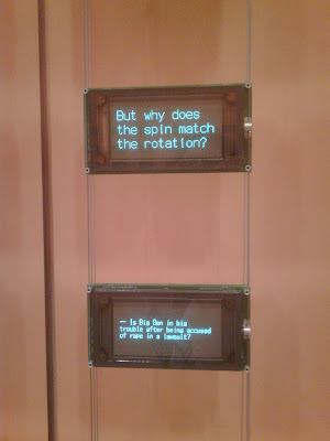
This gave us an excellent opportunity to take in "Moveable Type", the fascinating installation my the artists Ben Rubin and Mark Hansen. We first encountered these two at the Whitney Museum of American Art where they had installed "Listening Post" in the small gallery off the lobby. This remarkable piece used technological 'spiders' to forage through Internet chat room, postings, and IMs to gather instances and phrases that all shared a common word or phrase; "I am 50 years old" and "I am just wearing socks". These gleaned words and phrases were then displayed in a neat grid of small led display panels. The end result was an engrossing piece which could suck the viewer in for hours without repetition or boredom.


With "Moveable Type" the art duo have taken the concept of "The Listening Booth" and broadened it, both in size and scope. Taking up both sides of a long, wood-paneled entry corridor, the walls are lined with an array of 6" by 1" LED displays totaling an area of 20 feet high by 53 feet long. Using the New York Times and its archives as fodder, the team has set up various searches and function that these walls of information perform. Sometimes the information is so quick its hard to read; with a static sizzle of the screens, it appears and disappears. Occasionally a 'wind' of information sweeps across each wall, sometimes leaving random panels of information for awhile, sometimes not. One feature presents columns of pronouns juxtaposed next to each other. For instance, "I know this works." sits on a screen to the left of one reading "You tie the dog in the yard." I-You is stacked over We-They which is placed over He-She and the phrases keep shifting and changing until the wall are blank and dark. To keep things from being totally word based, occasionally the screens tick out the outlines of states and countries in the news. Then suddenly the hall fills with a wonderful Phillip Glass-like cadenza of electronic keyboards as NY Times stories rapidly rise up the columns of the walls, the music finally fading with the last of the final story.


A favorite function of ours was what we refer to a the 'number pull' (see video above). As numbers appear in the lower right corner of each screen, a phrase or line from the paper with that particular number is typed across the upper line of the screen. The screens build and build with more numbers and fade to a final number 1. Another favorite is the letters to the editors display. The halls fill with the harsh clack of an old typewriter and the letters "To The Editor:" are typed out on the LED screens. As the actual letters start to appears and fill the other screens a growing mummer of the tapping of computer keyboards accumulates and fades. Finally there is the information drawn from the Weddings section of the paper. As a screen fills with information about this person or that it gets surrounded by a simple line box which then continues its journey across other screens until it reaches another screen containing information about another person, presumably a relative or family member. We are presented with an active growing family tree right before out eyes, all to the accompaniment of the sound of touch-tone dialing!


We spent almost two hours wandering up and down the hall on the Times and were not bored for a single minute! Stop in, its well worth a trip uptown (or down)!!


Thursday, September 3, 2009

Seen on the Scene

Art on the Docks: Governor's Island Ferry Terminal seen from SI Ferry

Monday, October 20, 2008

A Monday Night in October, Time Square Subway Station, NYC


GILBERT & GEORGE IN TIME SQUARE

Thank you again Creative Time for helping us find this unexpected pleasure on a resent visit to Times Square on a Monday Night.


A Portrait of the Artists As Young Men, 1970; The Nature of Our Looking, 1972

October 3–November 14, 2008


These videos are running in conjunction with the last stop of their monumental retrospective on view at the Brooklyn Museum. We caught this show last year at the Tate Modern. Massive in its scope, gird your loins and take the plunge. There are some splendid rewards, especially in many of their mid-career stain-glass window homages to street boys.

Monday, September 22, 2008

FAILURE HITS THE UES - William Pope.L @ Mitchell-Innes & Nash

As the financial and house markets seemed to be coming down around our ears, we journeyed up to that bastion of gracious living and expense accounts, Madison Avenue and 79th Street to pop in to the opening of William Pope.L's first show with his new gallery, Mitchell-Innes & Nash. And what a pleasant surprise! What should we find covering four walls of one of the two main gallery areas but hundreds upon hundreds of "Failure" drawings. These small intimate drawings where all done on available paper while traveling, so we get a wide range of sizes; coasters, hotel stationery, notepads, small photos, etc). Beautifully installed!!

In the second gallery, are two larger pieces, plus a small wall sculpture consisting of two drinnking glasses with water. The large wooden coffin for the US flag is raised off the ground and emits the soft sound of a flag flapping in the wind.

Screw the NY Times! A great little debut show! ENCORE!!!

Thursday, July 10, 2008

LET IT FLOW, LET IT FLOW, LET IT FLOW - Olafur Eliasson's "The New York City Waterfalls"


If you haven't taken a ride on the Staten Island Ferry recently, take the opportunity to do so now! Not only will it cool you off from the city heat, but it will give you a magnificent opportunity to view all four of Olafur Eliasson's "The New York City Waterfalls" at once. Be sure to be at the back of the boat as it leaves the Manhattan side (or the front as it docks there).


These four waterfalls are actually enormous scaffold-like towers that pump river water up and out their tops. Aesthetically speaking they aren't much to look at, but their is something unmistakably magical about these waterfalls. Depending on their placement, width and height, the falls themselves have varying effects as they cascade down. I particularly like the effect of the tower on the Brooklyn piers; tall and wide, its placement seems to catch the breeze coming up the Narrows (or is it the traffic from the BQE?) and always seems to have the quality of an airy bridal veil. Eliasson is a master of emotional minimalism; vague and seemingly effortless, he is able to conjure a happy vertigo.

Check'em out!!


August 27th: Panned by "L" Magazine as the most disappointing public art work! Everyone keeps comparing it to"The Gates"! Why? You aren't able to interact with these pieces in the same way, but they can be enjoyed as unique, individual experiences. Will "L" query people about their feelings for the Falls at the end of their run in October? Anyone taking any bets?

Friday, January 4, 2008

AN AFTERNOON STROLL THROUGH CHELSEA

On a bitter cold day in early 2008 we found ourselves with a perfect parking spot on W 22 so we took a tour of the Chelsea galleries to see who was open. Here's what we saw:

ALBERTO BURRI @ MITCHELL-INNES & NASH
This retrospective of the late artist's works just knocked me for a loop. Well-rooted in the Arte Povera movement of the 1960's, Burri's work teams with the desire to find beauty in the most unusual places: Mail sacks sewn together and trussed with rope to stretchers creates a perfect combination of Mondrian Modernism with Sixties Minimalism; melted and burnt plastic create "action drawings" of delicate effect and lyricism; and the two large panels at the rear of the gallery appear like enormous sections of deeply parched earth, one pale, one black! Check it out before it closes January 18th!!

YASUMASA MORIMURA @ LUHRING AUGUSTINE
Morimura takes on men and history! In the first gallery are large stills of the artist recreating historic men in historic moments: two Einsteins, one sticking his tongue out, one not; Morimura as Lee Harvey Oswald being shot, as Trotsky & Lenin, as Charlie Chaplin in "The Great Dictator". In the rear gallery are three large video projects. These Requiems present three historic events in current time and space. We see Morimura as Lenin delivering his great address to "the people", here an actual group of street people who just sort of "hang around", dissipating as the artist sprinkles them with artificial snow. We also get Morimura as Charlie Chaplin as Hitler, which starts off brilliantly with an onerous speech in gibberish made of national adjectives (Chinese, British) then turns long-winded, as he spouts on about not wanting to be a dictator, whilst trying to recreate Chaplin's ballet with globe/balloon from "The Great Dictator" in the halls of some officious Japanese hall overlooking a highway. Then finally we get Morimura as Mishima, spurring on his uninterested audience to rise up in revolution and rebel. It's an ambitious project, but it gets bogged down by its own weight. The video lacks the joie-de-vivre we get from a Morimura still, even one of him being shot point blank by a Jack Ruby stand-in.

90° The Margins as Center @ ANDREA ROSEN GALLERY
A rather upscale market show which has allowed the staff to renew their affinity with corners of their gallery. You're heartily greeted by a large globular sculpture from 1969 by Lynda Benglis. Head straight back, going under Robert Morris' "Untitled" (Corner Beam), 1964, to Gallery Two where a heavenly James Turrell corner piece glows blue. And no corner show could be complete with out the maestro himself, Richard Serra, represented here with two large prop pieces with two bored security guards (Mind The Black Tape). Worth a pop in. Very posh!!

Also seen:

Group Show @ Sonnabend Gallery - A lot of the usual suspects. Check out Matthew Weinstein's "Triumph of Painting" series and the Haim Steinbachs in the back.

Joel Shapiro @ Pace Wilderstein - Bigger is not better in this case. Nor is bronze, which makes a number of these works feel bulky. The standouts here are the pieces in wood. Stained on some sides, each block is interesting in its own construction, and they come together with a lightness the other works lack.

The Geometry of Seeing: The Art of Elaine Lustig Cohen 1966 - 2007 @ Julie Saul Gallery - Art by a renown graphic designer. The collages are very well done indeed.

Friday, November 16, 2007

GEORGE SEURAT & MARTIN PURYEAR @ MoMA

We took in these two big shows at the Art Barn of Modern Art (ABoMA) yesterday with friends. The museum's exhibitions crew have carved out five nice galleries on the sixth floor to exhibit George Seurat: The Drawings. It should be mentioned that SOMEONE felt the need to pepper the show with several small painted canvases, whose soul purpose seems to be to add a bit of color to this very black and white show. But oh what blacks!! The first image to pop out at you as you enter the first gallery, which is dedicated to early works and academic drawings, is a female nude. It is a fine example of this artist's mastery of the conté crayon, and the plump soft curves of the model seem to spring off the paper. And we see lots of women throughout the exhibit: nurses with babies, women from behind, women with parasols, singers, his mother. All are rendered with incredible sensitivity to the medium on the paper. In one drawing, Place de la Concorde, Winter, this touch allows you entrée into a snowy winter in Paris years ago. In others, like The Veil and The Lamp, the unusual chose of subject or angle along with his lightness of his hand almost seem to put Seurat in the Symbolist camp. This show, which is not traveling, is comprised of many works from private collections. It also allows visitors to see seven of nine Café Concert drawings. Done by Seurat late in his life (he died in 1891 at the age of 31), they become both academic and social studies, showing not only the gaslight reflecting off the performer, but a feel of the urban mix of the milieu. The final one of these works, Café Singer, 1887-88, is done on Gillot paper, very likely for gillotage, an early reproduction method, and shows the artist reclaiming many subtle details that he had foregone in pursuit of Pointillism. In the Age of Mechanical Reproduction, would the artist have returned to his more academic roots to reach the broader masses that he documented? Discuss amongst yourselves.

I have passed through Martin Puryear exhibits over the years at various galleries, usually wandering in and out without too much to say. But seeing them at the artist's current retrospective at MoMA allowed me to see this artist in a new light. Things that were "well-crafted" and "interesting" in smaller spaces, became much more mesmerizing and fascinating when seen among their brethren in ABoMA's behemoth sixth floor gallery and second floor atrium. Forms and materials are revisited; shapes emerge and grow. Titles can reveal meaning or hide it, but what remains with Puryear is his uncanny ability to reinvent certain simple shapes: wall circles made from tree branches, turn into long weeping ovals of thin veneer, turn into images of tribal Fang masks. We are presented again and again with some unenterable space; are we being kept safe or kept out? Two large sculptures in the atrium, Ladder for Booker T. Washington and Ad Astra, both give us a feeling of monumental striving, but towards what? The tip of the latter work can be seen near the balcony of the sixth floor galleries! Oh, why reach for the moon when we have ABoMA!!