Wednesday, December 16, 2009
A GLEANER'S DINNER - Thoughts on Food Pt. 1
1) DOSA GARDEN, 323 Victory Blvd (@ Cebra), Staten Island, NY 10301
This Indian restaurant, in the heart of the Island's Sri Lankan neighborhood, specializes in Southern Indian delicacies and does a magnificent job of preparing regional dishes such as vada, uttappam, and its namesake, dosa. Paper Masala Dosa is beautifully rolled and stuffed with a robustly spiced potato filling. More 'classic' Indian dishes are savory, rich and flavorful. Chicken Korma should be ordered with plenty of hot fresh naan bread to dip in this delectable sauce. Vegetarian dishes are outstanding, including some of the best palak paneer this side of the Pecos! And you can't go wrong with a samosa appetizer; the two veggie turnovers are richly stuffed and fresh. Did we mention reasonable? Decor could use some work but the service is always friendly and informed.
S61 S62 S66 S46 S48 to Cebra
2) PIER 76, 76 Bay Street, Staten Island, NY 10301
Heaven shone brightly on the North Shore of Staten Island this year with the opening of Pier 76. In easy walking distance to the ferry, this North Shore Italian eatery offers not only Joe & Pat's-style thin crust pizza, but inspired Nouveau Italian from its CIA trained owner. Call from the ferry and it's ready for pick-up by the time you walk there!! The 'fellas' did a lovely job of refurbishing the beautiful bar in the lovely appointed dining room. Check out the Caesar Salad pizza; sounds crazy, tastes delicious!!
2 stops on S46, S48, S52, S61, S62, S66, S74, S76 - Bay & Central
3) Pita Joe's, 2 W 14 St, New York, NY 10011
At the crossroads of uptown/downtown east/west this fab little eatery produces some of the best falafel I've had in NYC in years! Joe is a hard core Israeli and it come out in his falafel; crisp, flavorful & satisfying. Chicken cutlets, schnitzeled or grilled, are also available, along with salads and platters. Joe also offers an interesting selection of flavored lemonades. A fabulous, reasonable lunchtime treat!!
To be continued...
Thursday, December 3, 2009
A WALK THROUGH CHELSEA
PETER FISCHLI/DAVID WEISS "SUN, MOON & STARS" @ MATTHEW MARKS - An encyclopedic work by the leader alchemists of the art world. A dizzying series of tables provide a chromatic study of magazine advertisements that also follow a bizarre uncanny narrative. Entertaining and engaging up close, I had wished there was a bit MORE room in the gallery to display their larger essence. "CLAY AND RUBBER" at the gallery's 24th St Outpost is another anthology, this of 24 everyday objects cast in one of the two title materials. Masterfully done, I couldn't help get the feeling I was in a really high-end Home Depot!
Up until January 16, 2010 - WORTH A LOOK!
LYNDA BENGLIS @ CHEIM & READ - Large scale bronze wall hangings and free-standing objects. I like the general drift of these pieces, especially the two "Swinburne" pieces which are cast in tinted polyurethane. I start to run into problems here with the general surface of the work, which can be best described as wormy scatological. The two pink pieces redeem an otherwise unremarkable show.
Up until January 2, 2010 - TAKE A QUICK PEEK!
Also seen:
CHARLES RITCHIE "BOOKS & PAGES: 2004 - 2009" @ BRAVINLEE PROGRAMS - A lovely show of works on paper. Beautifully illumined pages are peppered with spidery script-scrawl. Masterful watercolors. Worth a trip in the 526 W 26th St building. STRAIGHTFORWARD & HONEST.
MATTHEW RITCHIE @ ANDREA ROSEN GALLERY - A monumental multimedia installation. Ambitious in scope it doesn't hold together as well as ANNA JÓELSDÓTTIR Anna Joeldottir's installation @ Stux. Make a walk through to take in the small Gallery 2 show of Pop icons, most notably a soft Oldenburg clothespin! Philadelphia Freedom!! MAKE A WALK-THRU.
CLIFFORD ROSS @ SONNABEND - Ross continues his study of ocean waves, an oeuvre that I not taken to in the past. But the artist has given these new prints are wider horizontally, echoing a film screen, and printed the image with archival pigment inks which provie these works a depth and substance they lacked previously. AN IMPRESSIVE STEP FORWARD.
SEAN SCULLY @ GALERIE LELONG - Luscious unremarkable paintings by a major American painter. one painting, LANDBAR, struggles to break the mold. IF YOU MUST.
ERIC FISCHL @ MARY BOONE - An uneventful exhibition by a major player on the painting scene. Matadors and nemeses in flashy style. Wonder where Mr. F will vacation next. SKIP IT.
Tuesday, October 27, 2009
Sunday, October 25, 2009
I ACCUSE PETER GREENAWAY - Peter Greenaway's "Rembrandt's J'accuse"
Let's keep it simple shall we?
This is the slickest art lecture ever captured on film! Greenaway draws on numerous images the director has employed in his past theater and film works, as well as an arsenal of Photoshop graphics to make the case that one of Rembrandt's most well-known and revered works is a visual accusation of murder and deceit. In 86 minutes we learn more about 17th century Dutch militia painting, its properties, Italian triumphal arches, chiaroscuro lighting, deliberate misrepresentations of height proportions, two mysterious women, a musket and innumerable other factoids all spun together with costume recreations and AVID editing.
If only the director/narrator weren't such a drone!
Visually ravishing and creatively edited, I only fell asleep twice!!
A Walk Through Chelsea
JUSTINE KURLAND 'THIS TRAIN IS BOUND FOR GLORY' @ MITCHELL-INNES & NASH - A large show of photographs inspired by the nomadic culture of the hobo. Handsomely formatted and hung. Kurland continues to grow as a photographer. Her landscape works has continued to mature and proves to be some of the more impressive work in the exhibit.
Up thru Nov. 14th - WORTH A LOOK!!
MAGNUS PLESSEN @ GLADSTONE GALLERY - A show of flashy paintings by this German painter. These works are all about surface and not much else. Technically intriguing, visually bland.
Closed Oct. 24th - LUCKY YOU!!
Also seen:
JANINE ANTONI: UP AGAINST @ LUHRING AUGUSTINE - A puzzling installation of photographs, installation and sculpture. A large noisy installation entitled Tear consists of an 11 foot video projection of the artist's eye in a room with and industrial wrecking ball. The series of small copper sculptures in the front gallery are not merely gargoyles, but devices for women to urinate standing up. A large color photograph of the artist using the 'device' near the gargoyles of the Chrysler Building serves as an instruction manual. Closed Oct. 24th - LUCKY YOU!!
ANSELM REYLE & TAKASHI MURAKAMI @ GAGOSIAN GALLERY - Pop Art meets Arte Povera by the former, a large colorful painting by the latter. Reyle's work has the fun and tang of a glass of champagne: you enjoy it at the beginning but probably hard to bear in the harsh light of a hung-over morning. Murakami's large canvas has rekindled my hope that this artist can actually produce artwork and not just manufacture kitsch.
TIM RODA @ DANIEL COONEY GALLERY: an interesting installation by an architect turned photographer. Taken in Italy and using his family as models, Roda creates and recreates a wondrous world of myth. The prints hang raw on the wall; many are on uneven cut pieces of paper. The artist has a good visceral sense of image. We look forward to more. UP THRU OCT. 31 - WORTH A LOOK
JAUME PLENSA 'IN THE MIDST OF DREAMS' @ GALERIE LELONG - Three enormous resin heads lit from within are the centerpiece of this show, but the pieces that really stand out are the elongated stone heads that are raw and broken at the top.
Wednesday, October 21, 2009
VIA CON DIOS, MI CAFE - Starbuck's VIA Instant Coffee
On my past three visits I've been queried by staff as to my familiarity with the company's latest product/innovation VIA, its answer to instant coffee. And who am I to resist a hard sell and special introductory pricing?
So, have they surmounted the wishy-washy stigma of instant coffee?
I have sampled both 'flavors' or blends, 'medium' or Columbian and 'extra bold' or Italian roast. It should be noted that both 'flavors' have a slightly oily taste and quality, which makes straight black coffee drinking a bit tough. Besides that, neither of them are watery in their flavor.
Of the two, the latter is much more drinkable. Being a light and sweet drinker these days, the Italian roast makes a flavorful cup that I would make again. And at $1.00 / 8 oz cup it comes out as a Starbuck's bargain.
Tuesday, October 13, 2009
Irving Penn: A tribute
http://lens.blogs.nytimes.com/2009/10/07/parting-glance-irving-penn/
Sunday, September 6, 2009
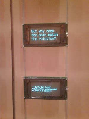
SIGNS @ THE TIMES: Moveable Type in the NY Times lobby
This gave us an excellent opportunity to take in "Moveable Type", the fascinating installation my the artists Ben Rubin and Mark Hansen. We first encountered these two at the Whitney Museum of American Art where they had installed "Listening Post" in the small gallery off the lobby. This remarkable piece used technological 'spiders' to forage through Internet chat room, postings, and IMs to gather instances and phrases that all shared a common word or phrase; "I am 50 years old" and "I am just wearing socks". These gleaned words and phrases were then displayed in a neat grid of small led display panels. The end result was an engrossing piece which could suck the viewer in for hours without repetition or boredom.
With "Moveable Type" the art duo have taken the concept of "The Listening Booth" and broadened it, both in size and scope. Taking up both sides of a long, wood-paneled entry corridor, the walls are lined with an array of 6" by 1" LED displays totaling an area of 20 feet high by 53 feet long. Using the New York Times and its archives as fodder, the team has set up various searches and function that these walls of information perform. Sometimes the information is so quick its hard to read; with a static sizzle of the screens, it appears and disappears. Occasionally a 'wind' of information sweeps across each wall, sometimes leaving random panels of information for awhile, sometimes not. One feature presents columns of pronouns juxtaposed next to each other. For instance, "I know this works." sits on a screen to the left of one reading "You tie the dog in the yard." I-You is stacked over We-They which is placed over He-She and the phrases keep shifting and changing until the wall are blank and dark. To keep things from being totally word based, occasionally the screens tick out the outlines of states and countries in the news. Then suddenly the hall fills with a wonderful Phillip Glass-like cadenza of electronic keyboards as NY Times stories rapidly rise up the columns of the walls, the music finally fading with the last of the final story.

A favorite function of ours was what we refer to a the 'number pull' (see video above). As numbers appear in the lower right corner of each screen, a phrase or line from the paper with that particular number is typed across the upper line of the screen. The screens build and build with more numbers and fade to a final number 1. Another favorite is the letters to the editors display. The halls fill with the harsh clack of an old typewriter and the letters "To The Editor:" are typed out on the LED screens. As the actual letters start to appears and fill the other screens a growing mummer of the tapping of computer keyboards accumulates and fades. Finally there is the information drawn from the Weddings section of the paper. As a screen fills with information about this person or that it gets surrounded by a simple line box which then continues its journey across other screens until it reaches another screen containing information about another person, presumably a relative or family member. We are presented with an active growing family tree right before out eyes, all to the accompaniment of the sound of touch-tone dialing!
We spent almost two hours wandering up and down the hall on the Times and were not bored for a single minute! Stop in, its well worth a trip uptown (or down)!!
More Jiggly Architecture
A visual update on an earlier reported Jiggly Architecture project.
We find this thing aluminum-foil-biting disturbing!!